A size guide that looks like your store
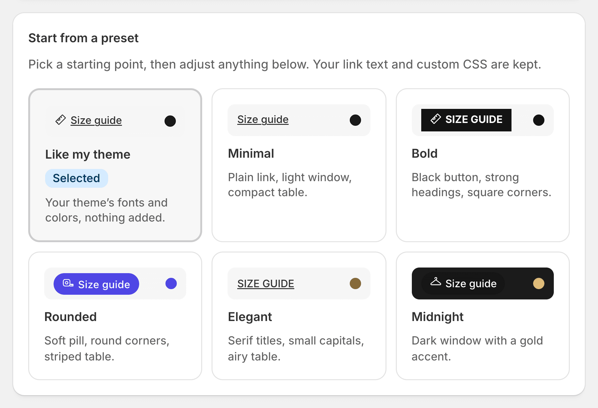
By default it takes your theme’s fonts and colors. Change anything else on one page: the link, the window, the tabs, the table, Find my size. 105 settings, six presets to start from, and a preview that runs the real size guide.

Four layouts, and more ways in
Choose per store, or per chart.
Popup
A window over the page that slides up from the bottom on phones.
Side drawer Pro
From the right or the left, the page still in view.
Inline Pro
The chart in the product page itself.
Accordion Pro
Folded with your theme’s own tabs and accordions.
Floating button Pro
Always in reach as shoppers scroll.
Quick view Pro
The guide follows the product into your theme’s quick view.
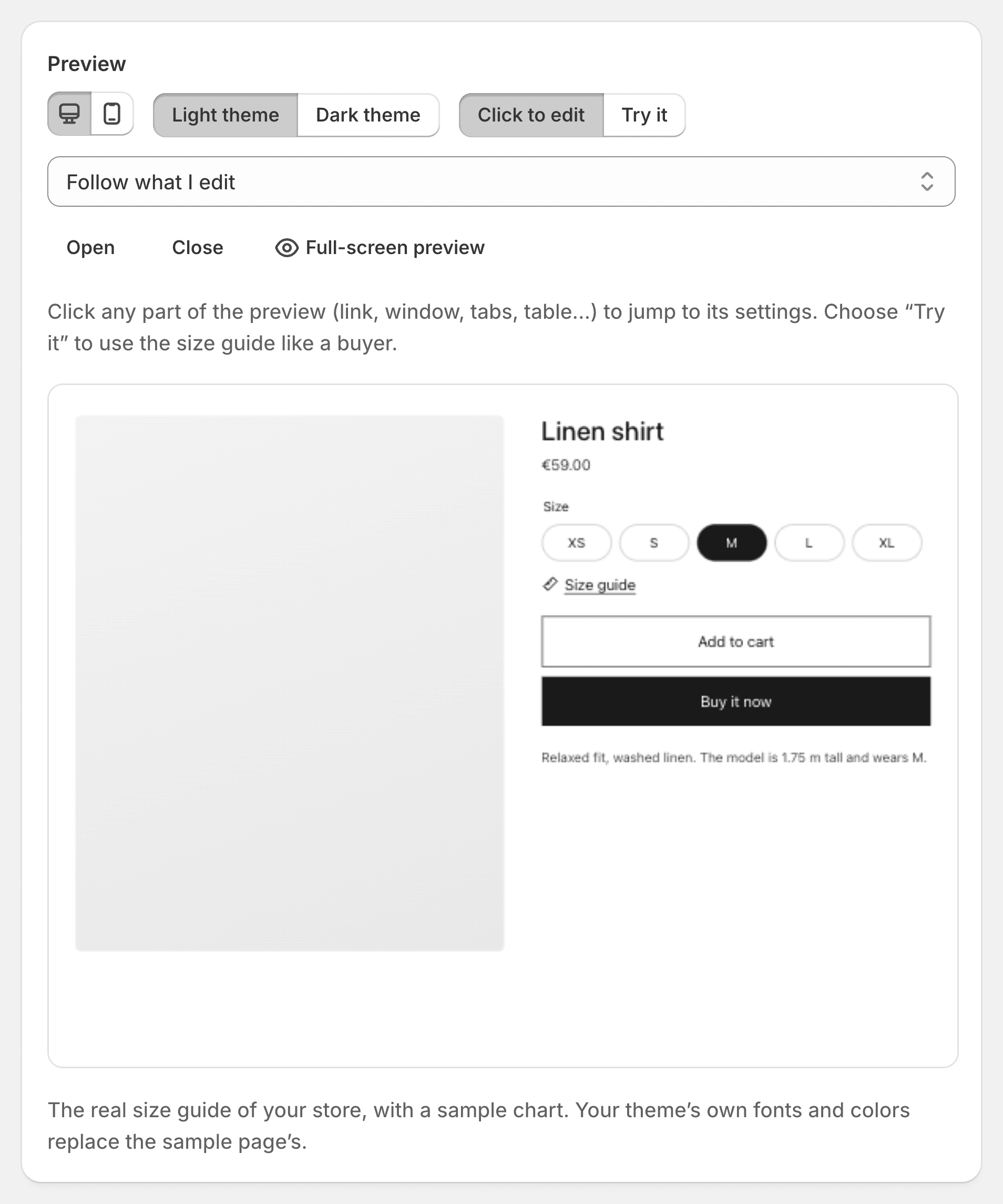
Click a part, change it
In the preview, click the link, the window, the tabs or the table to jump to its settings. Colors under a 4.5:1 contrast are flagged as you choose them.
Six presets
Like my theme, Minimal, Bold, Rounded, Elegant and Midnight.
40 icons
Rulers, tape measures, hangers, a ring, a shoe, or your own image.
Dark mode and custom CSS
Automatic with dark themes, or forced. CSS for the rest, scoped to the guide.
Details shoppers notice
Small things that answer questions before they are asked.
The chosen size, highlighted
In the table, following the size selected on the page.
Sold out sizes
Marked in the table, still readable.
Your size, on the page
A “Your size: M” badge next to the size selector.
Product photos in the guide
To compare without closing it. Off by default.
A gentle reminder
“Not sure about your size?” after a delay, once a visit, never stealing focus. Off by default.
Light on your store
Your theme writes the chart into the page. The scripts that open it come to under 9 KB compressed; Find my size and the rest load when a shopper asks. Keyboard, screen readers, 44 px targets on phones and right to left languages are tested on every release.
How it works
Pick a preset
Or keep your theme’s look, untouched.
Adjust in the preview
Click a part, change it, try it like a shopper.
Save
A chart can still keep its own link, window and accent.
Design and layouts: questions
Will the size guide match my theme?
Yes, by default it uses your theme’s fonts and colors. The Appearance page changes the rest, with a live preview.
Can each chart look different?
Yes. A chart can keep its own link style, window and accent color.
Which layouts are on the free plan?
The popup. The side drawer, inline, accordion, floating button and quick view are on Pro and Fit.
Is the size guide accessible?
It works with a keyboard and screen readers, keeps 44 px targets on phones, flags low-contrast colors and turns over for right to left languages.
Try Ruban Size on your store.
Free for 5 size charts. Pro and Fit start with a 14-day free trial, billed by Shopify.