
Where to put the size chart on a product page
Right next to the size option, above Add to cart, as a link that opens the chart without leaving the page. On phones, a panel that slides up from the bottom. Inline and accordion layouts suit pages where the chart belongs in the details.
Put the size guide link next to the size option: under the size picker, or beside its label, and above the Add to cart button. That's where the shopper decides on a size, so that's where the question comes up. Open the chart over the page, in a popup or a side drawer, so the shopper never loses the product. On phones, let it slide up from the bottom of the screen.
The rest of this article is about the choices around that: which layout, what changes on a phone, and how to get the link in the right spot on your theme.
Next to the size option, and nowhere far from it
A link in the right place answers the question at the moment it's asked. A link anywhere else asks the shopper to go looking.
- Under the size picker. Close enough to read as part of choosing a size, with a clear label like "Size guide".
- Not only in the description. On many themes the description sits below the buy buttons, and on a phone that can be several screens down.
- Not only in the footer. A size guide page in the menu is a good extra for shoppers who check before they browse. It doesn't replace a link on the product.
- Not hidden in a tab at the bottom. Same problem as the description: it's there, but not where the size gets chosen.
Popup, drawer, inline, accordion or floating button
Once the link is in place, the layout decides how the chart opens.
| Layout | How it opens | Good for | Keep in mind |
|---|---|---|---|
| Popup | A window over the page; from the bottom on phones | Most stores, most products | Covers the product photo while open |
| Side drawer | Slides in from the right or the left | Wide screens, comparing with photos | Less width for very wide tables |
| Inline | The chart is part of the page | Products where the size is the main question | Pushes the rest of the page down |
| Accordion | Folded with the theme's other tabs | Pages that already fold details and shipping | One more tap to reach it |
| Floating button | A button that stays on screen | Long pages, lots of scrolling | Shares the corner with chat buttons |
Two more ways in, for shoppers who don't start on a product page. In Ruban Size, the guide can follow the product into your theme's quick view, and a size guide page can list every chart, with a search and categories.
For most stores, start with the popup next to the size option. Move to a drawer if your photos are what shoppers compare against, and to inline or accordion for products such as bras or rings, where sizing is half of what the page explains.
In Ruban Size, the popup is on every plan. The side drawer, inline, accordion, floating button and quick view come with Pro and Fit, as listed on the pricing page. Each chart can also keep its own layout, link style and accent color, so a ring chart can open inline while the rest of the store uses the popup. The design page shows every layout.
What changes on a phone
On a phone, a centered window wastes the space a shopper needs, and its close button often sits out of reach. A panel that slides up from the bottom keeps the page visible above it and the controls within reach of the thumb.
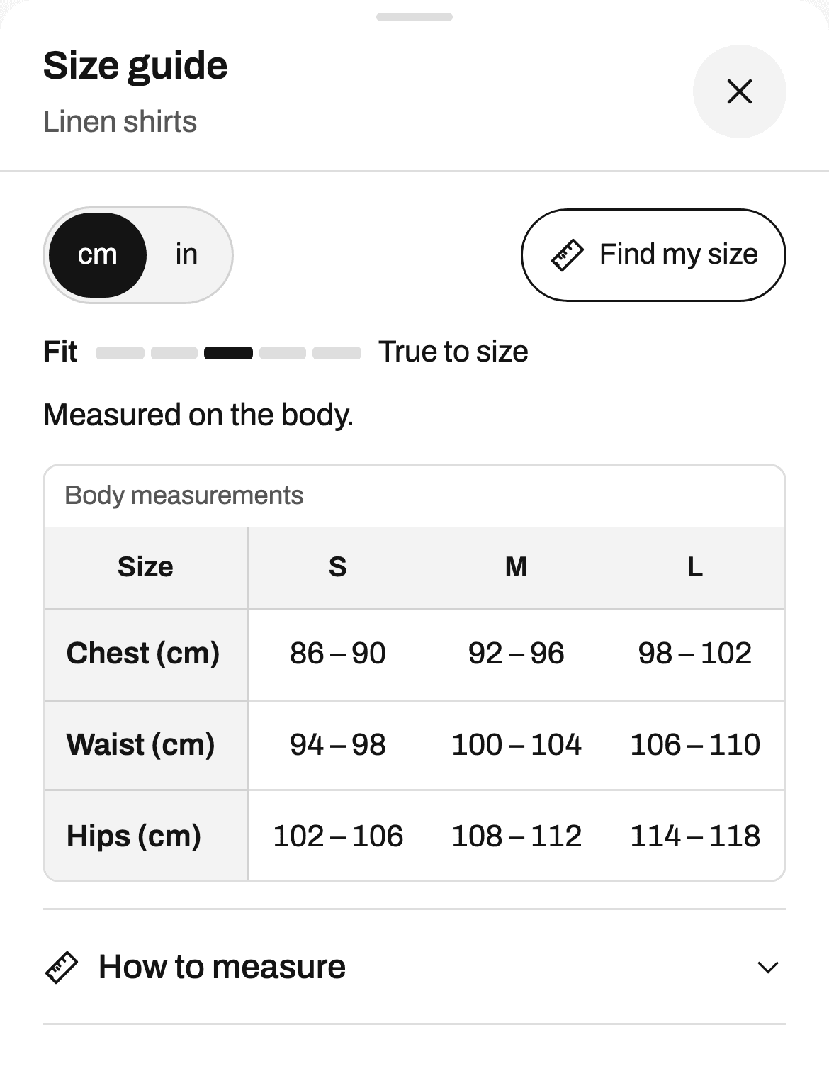
A few details make it work:
- Headers that stay in place. The header row and the size column stay visible as the shopper scrolls the table, so a number never loses its size.
- Targets of 44 px. The close button, the unit switch and the Find my size buttons are big enough to tap.
- Fields at 16 px. Find my size uses 16 px text in its fields, so iPhones don't zoom the page when a shopper types a measurement.
- One tap for units. Centimeters or inches, remembered for the next product.
Images of charts fail here first. We look at why in size charts on phones.
What to put beside the link
The link can do more than open a table:
- The chosen size, highlighted. When a shopper picks M on the page, the M column is marked in the table.
- "Your size: M". After Find my size, a badge next to the size selector shows the size on every product, without an account. The size finder page explains how it's worked out.
- Sold-out sizes, marked. Still readable in the table, with a label.
- A gentle reminder. "Not sure about your size?" after a delay, once a visit, if the guide wasn't opened. Off by default.
Getting the link in the right spot on your theme
With Ruban Size there are two ways in, both from the theme editor:
- The app embed. Turn it on and save. On 25 of the 26 themes most used by stores with size charts (checked on the themes of 1,121 stores), the link places itself next to the size option.
- The app block. On Online Store 2.0 themes, add the Size chart block to the product page and drag it exactly where you want. That's also how you get the chart inline.
Coming from another size chart app, the guide shows where the old link was (in the same style, from Kiwi, MP or BF) and hides the old link until you uninstall it. And if the link still isn't where you want it, we place it for you: free, by hand, with a reply within the day. Write to us from the contact page. The theme editor steps are in adding a size chart to Dawn and Horizon.
Questions
Should a size chart open in a popup or show on the page?
A popup next to the size option suits most products: the chart is one tap away and the page stays put. Show it inline, or in an accordion, when sizing is a large part of the product, as with bras, rings or technical gear.
Where should the size guide link go on a product page?
Directly under or beside the size option, above the Add to cart button. That's where the size gets chosen; a link in the description or the footer asks shoppers to go looking.
Can the size guide open in my theme's quick view?
With Ruban Size, yes, on Pro and Fit: turn on the quick view option of the app embed in the theme editor, and the guide follows the product into the quick view.
Can different products use different layouts?
Yes. In Ruban Size, a chart can keep its own layout, link style and accent color, so one kind of product can open inline while the others use the popup.
Keep reading
- Shopify guidesAdding a size chart to the Dawn and Horizon themesTurn on the app embed in the theme editor and save: on Dawn and Horizon, the Ruban Size link lands next to the size option by itself. Add the app block instead when you want a fixed spot, or the chart inline on the page.5 min
- Shopify guidesSize charts on phones: why image charts failAn image chart made on a desktop shrinks to the width of a phone, so its numbers get too small to read, and it can't switch units, be searched or be read aloud. A real table in a panel that slides up from the bottom, with headers that stay put and big tap targets, fixes all of it.5 min
- Shopify guidesHow to add a size chart to ShopifyShopify has no size chart tool of its own, so you add one with an image, a page, metafields or an app. An app gives you real tables, the right chart on each product and a cm/in switch; the other ways mostly get you an image.6 min
- Shopify guidesHow to show a different size chart on each Shopify productLet the data your products already carry pick the chart. A rule on a tag, a product type, a vendor or a collection covers most catalogs, title and SKU conditions catch the rest, and exclusions and priority settle the overlaps.6 min