
Size info in product page tabs and accordions
Tabs and accordions are a good home for the full size chart, how to measure and fit notes, as long as a size guide link also sits next to the size option. A tab below the buy button is easy to miss on a phone; the link is where the size gets chosen.
Product page tabs and accordions are a tidy place for size information: the full chart, how to measure, how the item fits, what to do if it doesn't. They keep a long page short, and shoppers who want the detail open it. What they shouldn't be is the only place sizes appear, because on many themes they sit under the description and the buy buttons, far from where the size gets picked.
So the setup that works best has two parts: a "Size guide" link next to the size option, and the detail in a tab or an accordion row further down.
What theme tabs and accordions are
Many Shopify themes let you add folding rows or tabs to the product page from the theme editor. Dawn, for example, has Collapsible row blocks: each has a heading, an optional icon, and content you type or pull from one of your pages. Other themes call them tabs, accordions or product details.
Their content is set on the product template, so by default every product using that template shows the same rows. To vary a row by product, you connect it to a metafield, which holds a different value for each product, or you make separate product templates. Size charts and Shopify metafields covers the metafield route.
Four ways to fill a size tab
| Way | Right chart on each product | Units | Upkeep |
|---|---|---|---|
| Text or a table typed in the row | No: the same on every product of the template | As typed | Edit the template |
| Content from a page | No: one page for all | As written on the page | Edit one page |
| A metafield connected to the row | Yes, set product by product | As typed | Fill in every product |
| A size chart app in an accordion layout | Yes, by rules | A cm/in switch | Edit one chart |
The first two work for a store with one kind of product. As soon as you sell tops and jeans, a single row shows the wrong chart on half the catalog, or one long chart that the shopper has to search.
What goes by the size option, what goes in the tab
Next to the size option:
- The link that opens the guide, labeled plainly: "Size guide".
- The shopper's size, if they've found it ("Your size: M").
- A one-line fit note, if the item runs small or large.
In the tab or accordion row, the rest of the size guide:
- The full chart, with every size system and measurement.
- How to measure, step by step.
- How the item fits: the cut, the fabric's stretch, the model's height and size if you show one.
- What happens if the size is wrong: exchanges, returns.
The link answers the question at the moment it's asked; the tab answers the follow-up questions. Where to put the size chart goes through the placement and layouts in detail.
On a phone
On a phone, the tabs usually stack under the description, often several screens below the size picker. A shopper who wonders about the size may not scroll down to look for it; they guess, or leave. That is the case for keeping the link by the size option even when the tab exists.
Two details help the tab itself. Name it the way shoppers think ("Size and fit", not "Specifications"), and put it first among the rows, before shipping and care. Tabs laid out side by side get cramped on small screens; folding rows stack and keep working.
How Ruban Size handles tabs and accordions
An accordion layout that matches your theme. On Online Store 2.0 themes, add the Size chart block to the product page in the theme editor and set its Layout to Accordion. The block becomes a folding row, labeled with the link text and its icon, that sits flush with the theme's own accordions, without doubled rules between them. Inside: the chart, how to measure, the unit switch and Find my size. Set the Layout to Inline on the page instead to show the chart open, as part of the page. Adding a size chart to Dawn and Horizon has the theme editor steps.
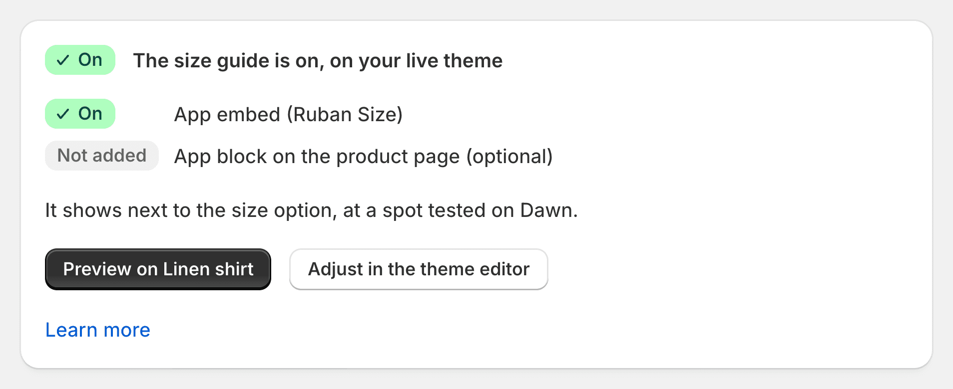
Only on products that have a chart. The block shows only on products a chart matches. Elsewhere it shows nothing, so one block on the template covers the whole catalog, and product rules decide which chart each product gets.
The embed steps aside. The app embed, which places the "Size guide" link next to the size option by itself, steps aside on pages where the Size chart block is present, so shoppers never see the guide twice. Place the block where you want shoppers to find the guide: by the size picker as a link, or among the rows as an accordion.
Tabs and accordions inside the chart. A chart is built from blocks in the size chart editor: a tabs block for body and garment measurements, an accordion block for "How to measure", "Fit" and "Returns" with the first section open, and shared sections for text you write once and reuse in every chart. When several charts match one product, a top and a bottom for example, they show as tabs, the highest priority first.
Plans. The popup layout is on every plan, including Free; the Accordion and Inline layouts, the side drawer and the floating button come with Pro and Fit, as the pricing page lists. On Free, the guide opens as a popup whatever the block says. The design page shows each layout.
Questions
Should the size chart go in a product tab?
The full chart can, with how to measure and fit notes. Keep a size guide link next to the size option as well, because a tab below the buy buttons is easy to miss, especially on a phone.
How do I add a size chart to a collapsible tab in Shopify?
In the theme editor, add a collapsible row to the product page and type the chart or pull it from a page. For a different chart on each product, connect the row to a metafield, or use a size chart app with an accordion layout.
Can I show a different size chart in the tab for each product?
Not with a typed row or a page, which are the same for every product of the template. A metafield per product or a size chart app with rules shows the right chart on each one.
Do tabs work on mobile?
Folding rows do: they stack under one another and open with a tap. Side-by-side tabs get cramped on small screens. Either way, put the size link by the size option so shoppers don't have to scroll down for it.
Keep reading
- Shopify guidesWhere to put the size chart on a product pageRight next to the size option, above Add to cart, as a link that opens the chart without leaving the page. On phones, a panel that slides up from the bottom. Inline and accordion layouts suit pages where the chart belongs in the details.5 min
- Shopify guidesAdding a size chart to the Dawn and Horizon themesTurn on the app embed in the theme editor and save: on Dawn and Horizon, the Ruban Size link lands next to the size option by itself. Add the app block instead when you want a fixed spot, or the chart inline on the page.5 min
- Shopify guidesSize charts and Shopify metafields: how they fit togetherMetafields add your own fields to products, and metaobjects let you define a kind of content, like a size chart, once and reuse it. You can build a chart from them yourself. Ruban Size uses the same pieces, so your charts live in your store and show without its servers.5 min
- Shopify guidesHow to add a size chart to ShopifyShopify has no size chart tool of its own, so you add one with an image, a page, metafields or an app. An app gives you real tables, the right chart on each product and a cm/in switch; the other ways mostly get you an image.6 min